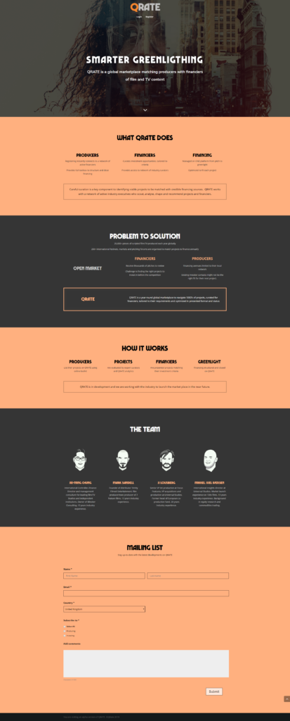
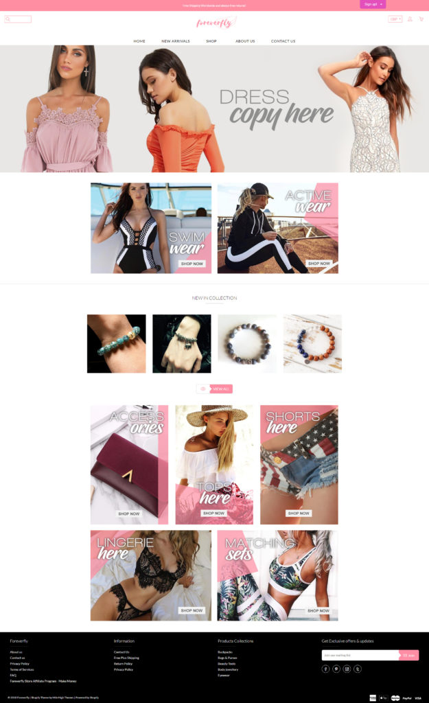
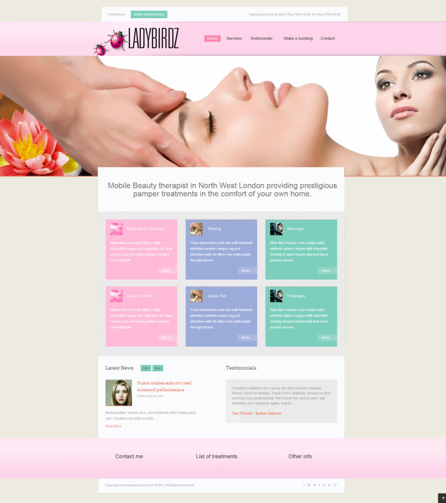
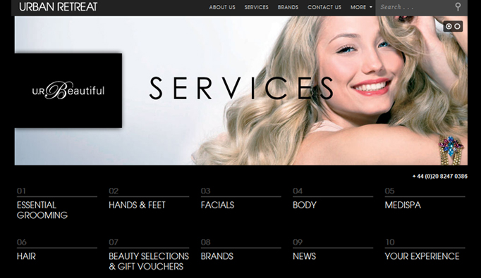
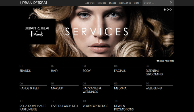
These website redesigns highlight my cross-platform design and development work. Each image represents a single page from a larger project. I’ve both designed and built sites on WordPress, Adobe Experience Manager, Drupal, Magento, Umbraco, and more—demonstrating adaptability and end-to-end web expertise.
Use the links below to explore websites I've redesigned
Synega website redesign using new Umbraco CMS
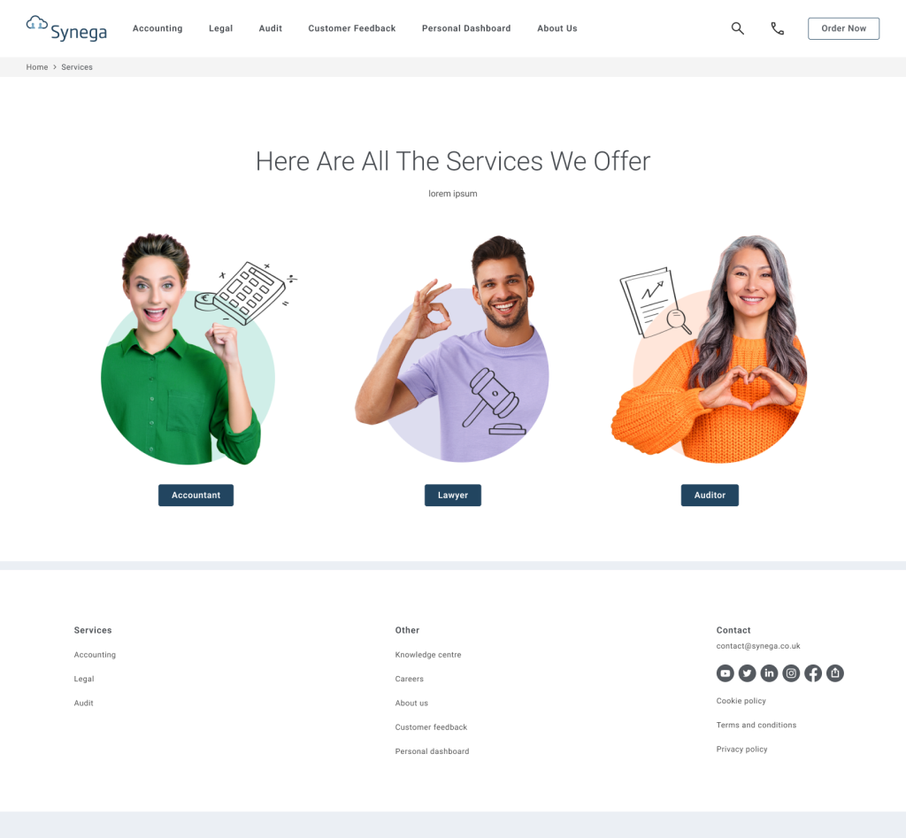
As part of the PO1 initiative at TTC (our in-house tech solutions agency), we collaborated with Synega, a European accounting company based in Norway, to integrate their services into our custom-built software ecosystem. Synega provides simple and transparent accounting services delivered through strong technical solutions, charged on a per-minute basis.
This project required us to shift our focus from travel to accounting—broadening the PO1 portfolio and expanding our expertise into new industries. Designing for a Norwegian audience introduced unique challenges, including adapting tone, imagery, and layout to suit local expectations and culture.
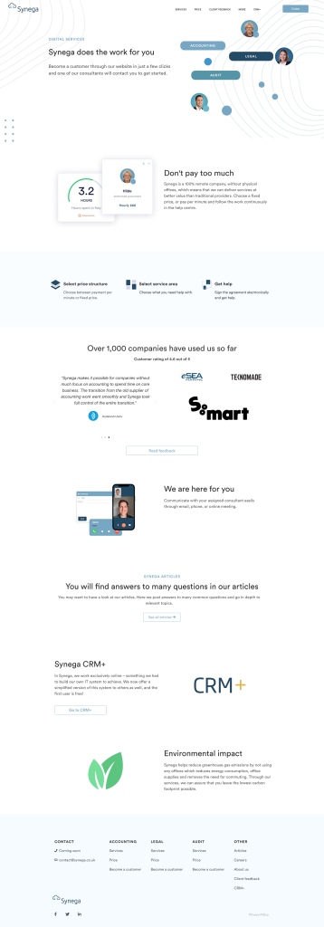
My role involved redesigning the entire website to meet Synega’s requirements for a clean, modern, and easy-to-navigate experience. The visual direction blended human-centric photography with subtle illustrative elements to maintain warmth and accessibility. I also developed a new brand palette, selected typography, and ensured visual consistency throughout.
A key part of the process was creating custom icons from scratch—hand-drawn in Illustrator using a graphics pad and individually approved by the client before being integrated into full-page mockups. Starting from rough concepts that combined curated stock imagery and bespoke iconography, I refined the design through feedback rounds until final approval.
This project was a deep dive into cultural design adaptation, cross-industry branding, and hands-on creative production—all within a collaborative, fast-moving international context.
Homepage
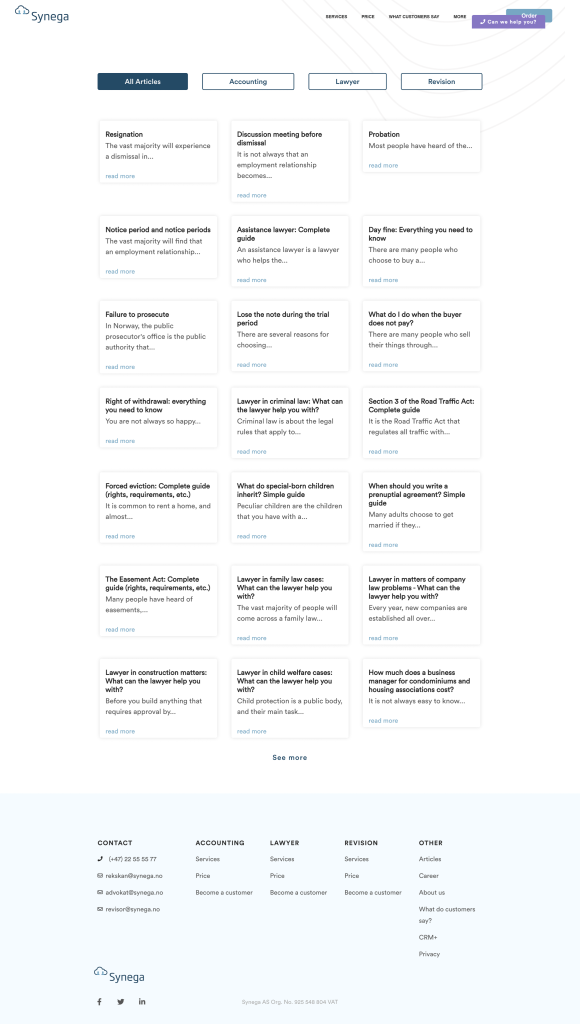
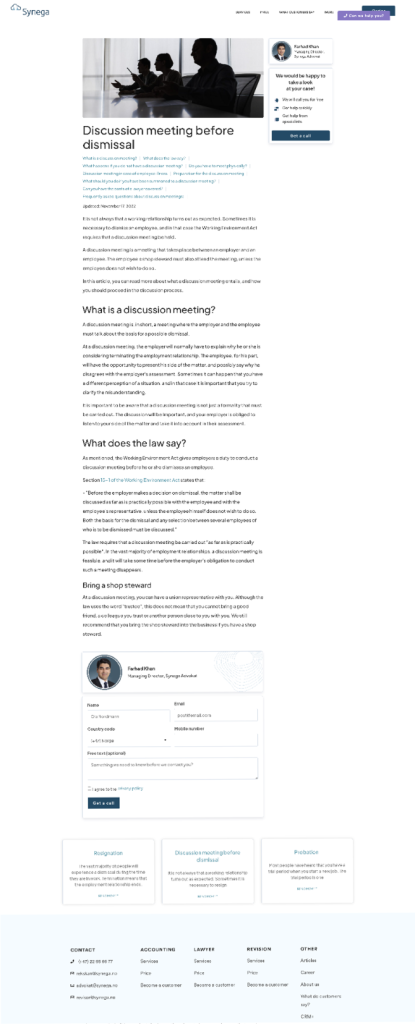
Articles hub
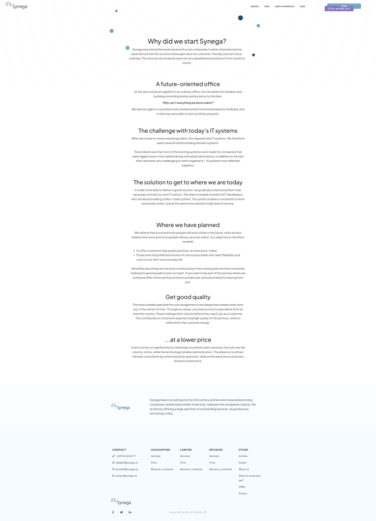
About Us
Services
Customer services form flow, imagery theme suggestions and recommended imagery per regions
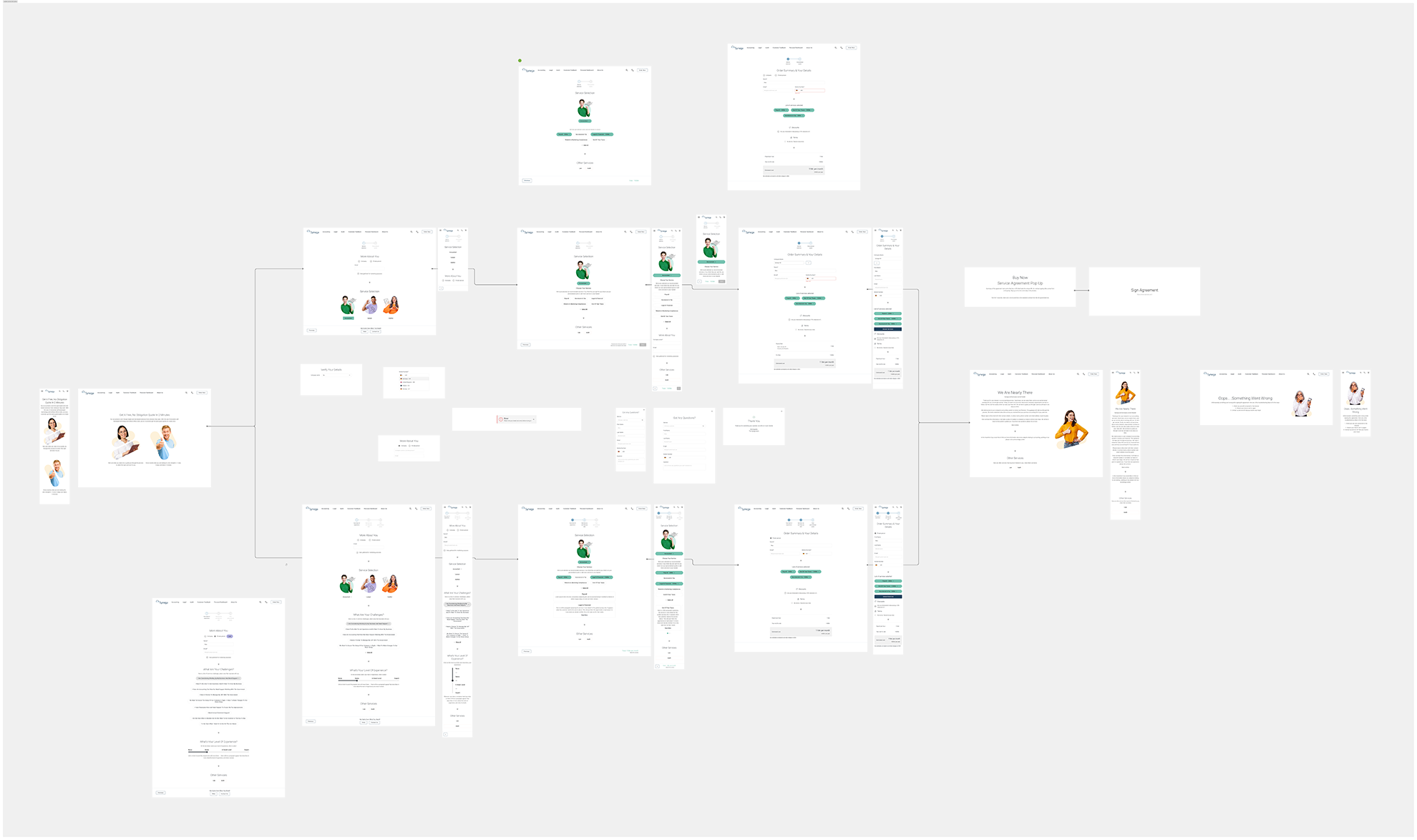
As part of the Synega website redesign, the company requested a customer service form that would guide users through a series of questions and answers to help direct their inquiries efficiently. I was responsible for designing the user flow and interface, applying UX and UI best practices to ensure the experience was as intuitive, clean, and streamlined as possible.
Because the form required multiple conditional flows, I mapped out all user journeys in Figma for review and approval by Synega’s CEO before development began. Throughout the design process, I focused on leveraging existing components from our design system to minimize development time and ensure consistency across the site. This reusable approach not only maintained brand alignment but also saved significant build time within the tight three-month project window.
The result was a well-structured, efficient customer service flow that balanced user simplicity with development practicality—delivering a seamless solution aligned with both business goals and user needs.
Below is a screen showing my photography direction process — on the left are the initial ideas and inspiration, and on the right is the final curated selection, refined and allocated for use across different regions. This ensured each market had imagery that felt relevant and authentic while maintaining overall brand consistency.
AAT Kings website redesign
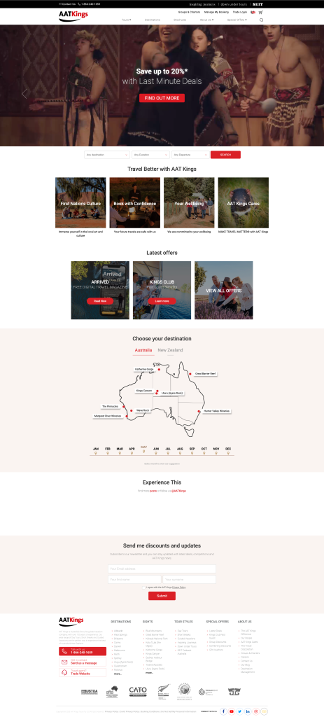
This was another PO1 initiative, built on the new Umbraco platform, where we developed a style guide and website mockups for the client’s main and tour pages. The goal was to translate their existing branding into our design system—leveraging as many pre-existing components as possible from our internal library, while also creating custom elements where needed to support the brand’s unique requirements.
The client’s audience is predominantly older, so it was important to retain the familiar look and feel of their current site while improving usability and consistency. With this in mind, I designed refreshed mockups that carefully balanced brand familiarity with modern UX standards, offering alternative layout and interaction solutions to enhance the user journey without disrupting audience comfort.
This approach ensured a smooth design-to-development process, maintaining efficiency, consistency, and accessibility within a cohesive design framework.
Adventure World website redesign
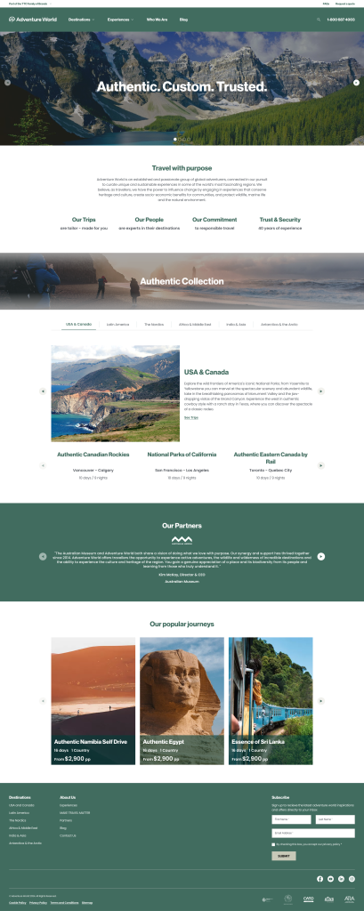
This was an exciting new onboarding project for the PO1 initiative, as the client’s old website was extremely outdated—visually and technically—resembling something built over 20 years ago. Using the PO1 component library, I focused on modernizing the site while maintaining efficiency through reusable design elements.
One of the main challenges was collaborating with the client’s in-house web designer, who had a different visual direction in mind. My initial designs—created using their style guide—were well received by the CEO, marketing team, and project leads. However, their designer later proposed changes with extremely large typography (titles at 64px and paragraph text at 30px) and non-accessible colour contrasts.
Despite our advice on accessibility, usability, and industry standards, the client decided to move forward with their designer’s approach. A few months after launch, analytics showed a significant drop in engagement and page views. Following user research, the client identified the oversized design as a key issue and asked us to revert to the original mockups I had created. After implementing these corrections, engagement and performance metrics improved notably.
This project highlighted the importance of UX best practices, accessibility, and data-driven design decisions, reinforcing that good design isn’t just about aesthetics—it’s about how users interact and respond.

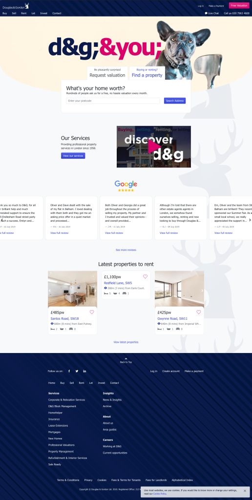
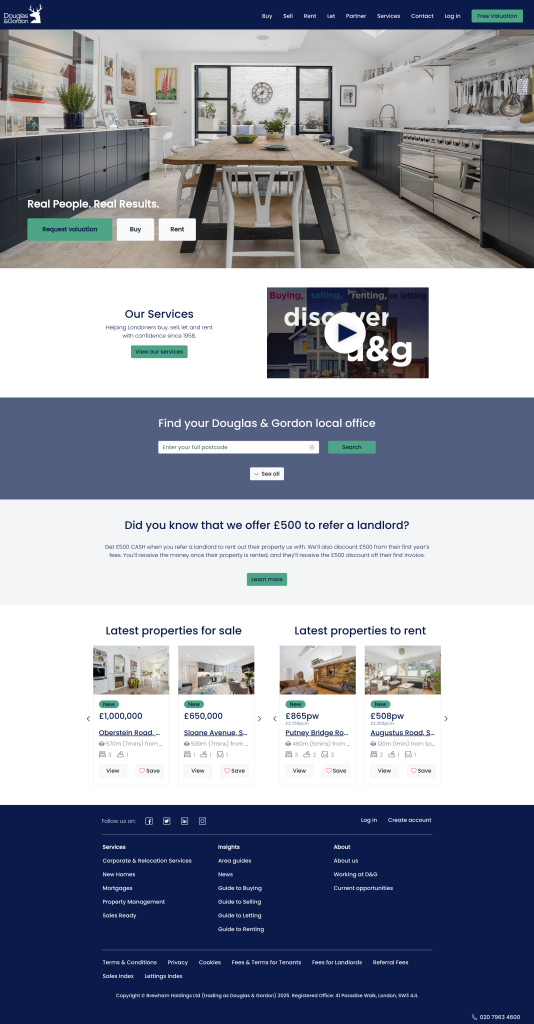
Redesign of Douglas & Gordon Estate Agency website
We have the before on the left and the after on the right, moving the website from WordPress to Umbraco, it was a complete redesign from new branding. Look and feel was all left up to me, i was given a list of requirement that i had to fulfil but everything else was my ideas, i worked with a remote developer to build the site too. For more info and image please click here for campaign details
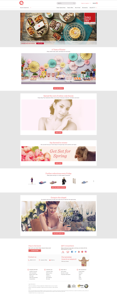
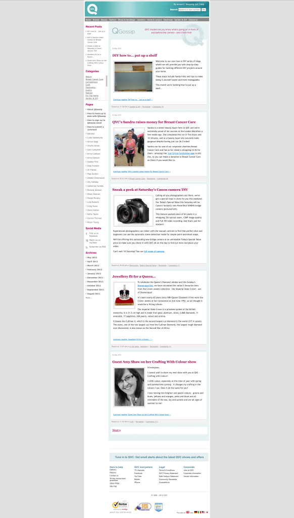
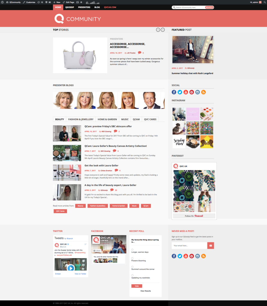
QVC website and blogs redesigns, with A/B testing for website homepage
When I joined QVC, my first major project was the complete redesign of the website as part of the company’s migration to Adobe Experience Manager (AEM). This move represented a huge improvement over the previous, outdated CMS, offering far greater flexibility and efficiency for the content and design teams.
We began by developing template-based designs to standardize layouts and streamline content management. The goal was to enable teams to build and update pages modularly—using drag-and-drop components rather than coded elements—allowing content to be created in minutes instead of hours or days. This approach also ensured consistency across pages, regardless of who was designing or updating them.
Our creative direction focused on letting product imagery take the lead, using clean layouts to help visuals and products sell themselves. After successfully establishing this system, we began experimenting with personalised customer experiences, running A/B tests to tailor content and layouts for logged-in users. These tests helped us better understand user behaviour and refine how the site adapted to individual shoppers—enhancing both engagement and conversion potential.
QVC Website
QVC Blogs
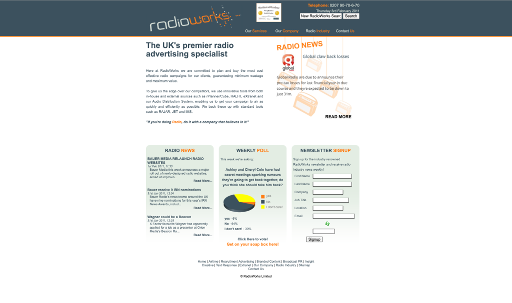
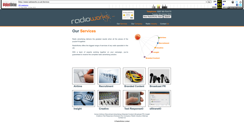
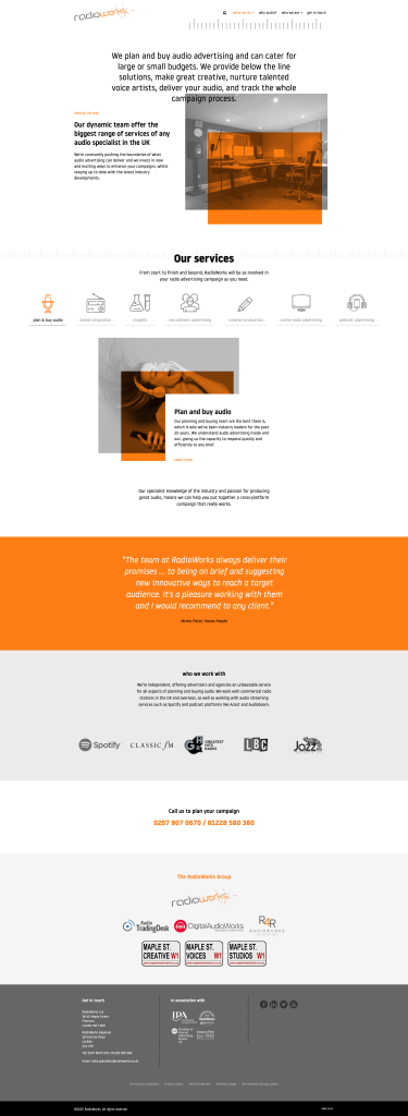
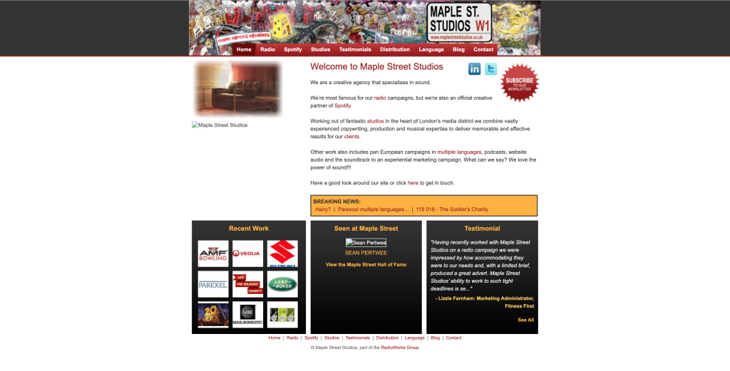
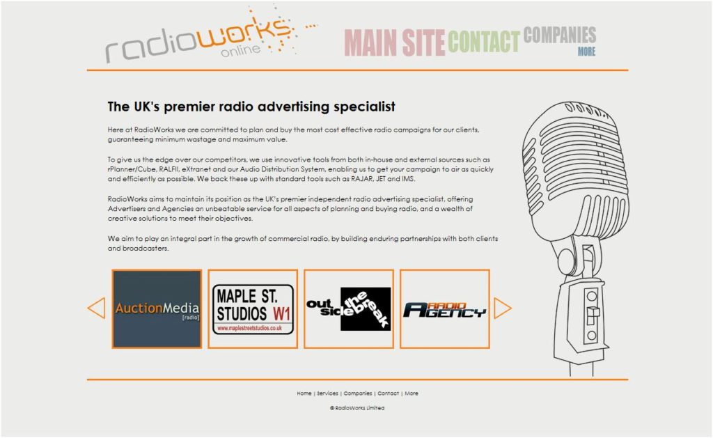
Redesign and dev of RadioWorks and Maple Street Studios websites
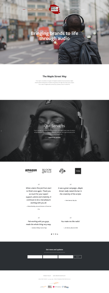
The original websites were built in Flash, making a full system and design overhaul essential. Rather than simply updating the visuals, I saw the opportunity to refresh the brand as a whole, with the new websites serving as the foundation for a more modern, engaging, and user-friendly digital presence.
This project involved redesigning four main websites, each aligned under a consistent brand direction that emphasised accessibility, clarity, and visual appeal. We selected WordPress as the CMS due to its versatility, wide range of plugins, and strong support for security, analytics, and scalability. The result was a cohesive, future-focused online experience that modernized both the brand identity and its digital infrastructure.
