UX/UI Design is a combination of two complementary disciplines:
-
User Experience (UX) Design focuses on the overall experience a user has when interacting with a product. It involves research, user flows, wireframes, and testing to ensure the product is useful, usable, and meets user needs effectively.
-
User Interface (UI) Design deals with the look and feel of the product. It includes visual design, typography, color schemes, buttons, and other interactive elements to ensure the interface is attractive, consistent, and easy to use.
In short, UX is about how it works, UI is about how it looks. Together, they ensure that digital products are not only functional and efficient but also visually appealing and enjoyable to use.
Use the links below to navigate between projects
Style guide content
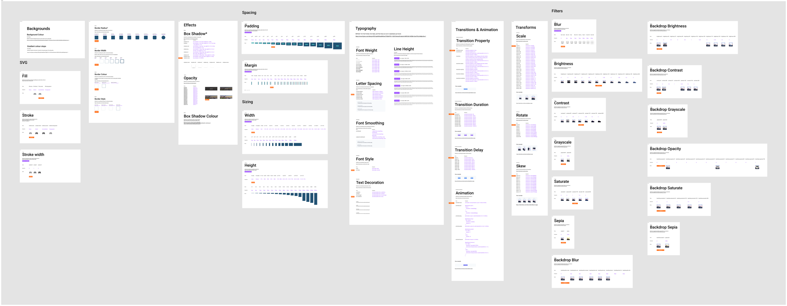
As part of The Travel Corporation’s transition to the new Umbraco platform, we’ve developed a baseline style guide to establish a unified foundation for all brands. This guide serves as a non-biased reference point, ensuring consistency, scalability, and ease of translation between design and development.
Purpose
The baseline style guide provides a shared visual and technical language that bridges the gap between designers and developers. It ensures that design decisions are directly translatable into code and that each brand can be onboarded efficiently while maintaining flexibility for unique brand identities.
Framework Alignment
We’ve adopted Tailwind CSS as our framework for front-end development. Accordingly, the style guide is built using Tailwind tokens and values, allowing for seamless alignment between design and code implementation.
Core Elements
The guide currently includes the following foundational elements:
- Typography: Hierarchy, font weights, and line heights mapped to Tailwind scales and Figma text styles.
- Colour System: Primary, secondary, UI and neutral palettes defined using brand colours and semantic token names
- Buttons & States: Consistent interactive components using shared spacing, border-radius, and opacity values
- Shadows & Depth: Standardised elevation levels aligned with Tailwind’s shadow utilities
- Corner Radius: Defined using Tailwind’s radius tokens for consistent curvature
- Opacity, Padding, and Spacing: Aligned with Tailwind spacing scales for predictable layout structure
The default values per brands will be highlighted within the document to make it easier for developers to add in the top level CSS or other component level code for brand consistency
We decided to use Google Material Icons across the site to ensure consistency in UI iconography. Since the icons are hosted on Google’s servers, they load quickly and efficiently.
The Material Icons system integrates seamlessly with Umbraco, allowing content editors to easily select and customize icons per brand. Customization options include thickness, fill style, and corner rounding, ensuring each brand can adapt icons to match its visual guidelines while maintaining a unified overall style.
Although individual brands may still use custom icons, using Material Icons for UI elements ensures visual harmony across all interfaces. All icons are stored online and readily accessible, making them easy to implement and manage.
In Figma, I created a Material Icons library linked to the component library. This setup allows for quick and consistent icon swapping when creating mockups for different brands, streamlining the design process and reinforcing consistency across all design outputs.
Collaboration
The creation of the style guide has been a cross-functional effort between design and development teams. We worked collaboratively to ensure that every visual decision could be directly implemented in code, reducing friction and promoting efficiency in the build process.
Next Steps
We began with the PO1 brand as our initial implementation. This serves as a proof of concept and baseline reference for future brand onboarding. Over time, this style guide will evolve into a comprehensive design system, with a fully fleshed out component library while maintaining a cohesive experience across all Travel Corporation brands.

Tailwind framework
Atomic design methodology and Design systems
My approach to the design system was based on Atomic Design methodology, ensuring that each component was built systematically from the ground up. The process began with the style guide, defining the foundational elements such as colors, typography, spacing, and iconography.
From there, I created the following layers:
-
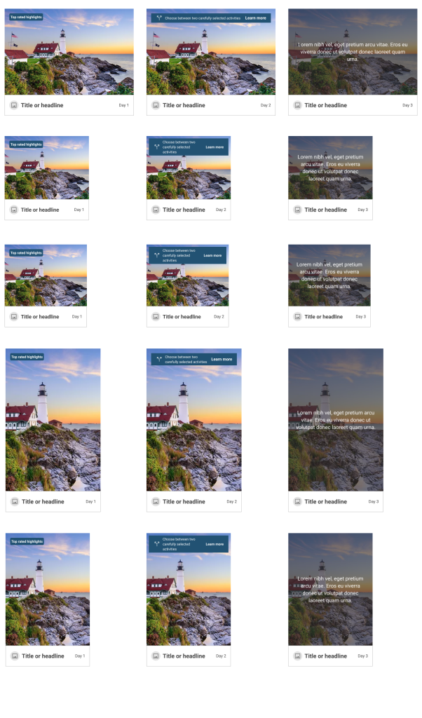
Atoms: These are the smallest building blocks — individual elements like icons, buttons, and images.
-
Molecules: Groups of atoms combined to form more complex UI pieces, such as an icon paired with a title or heading.
-
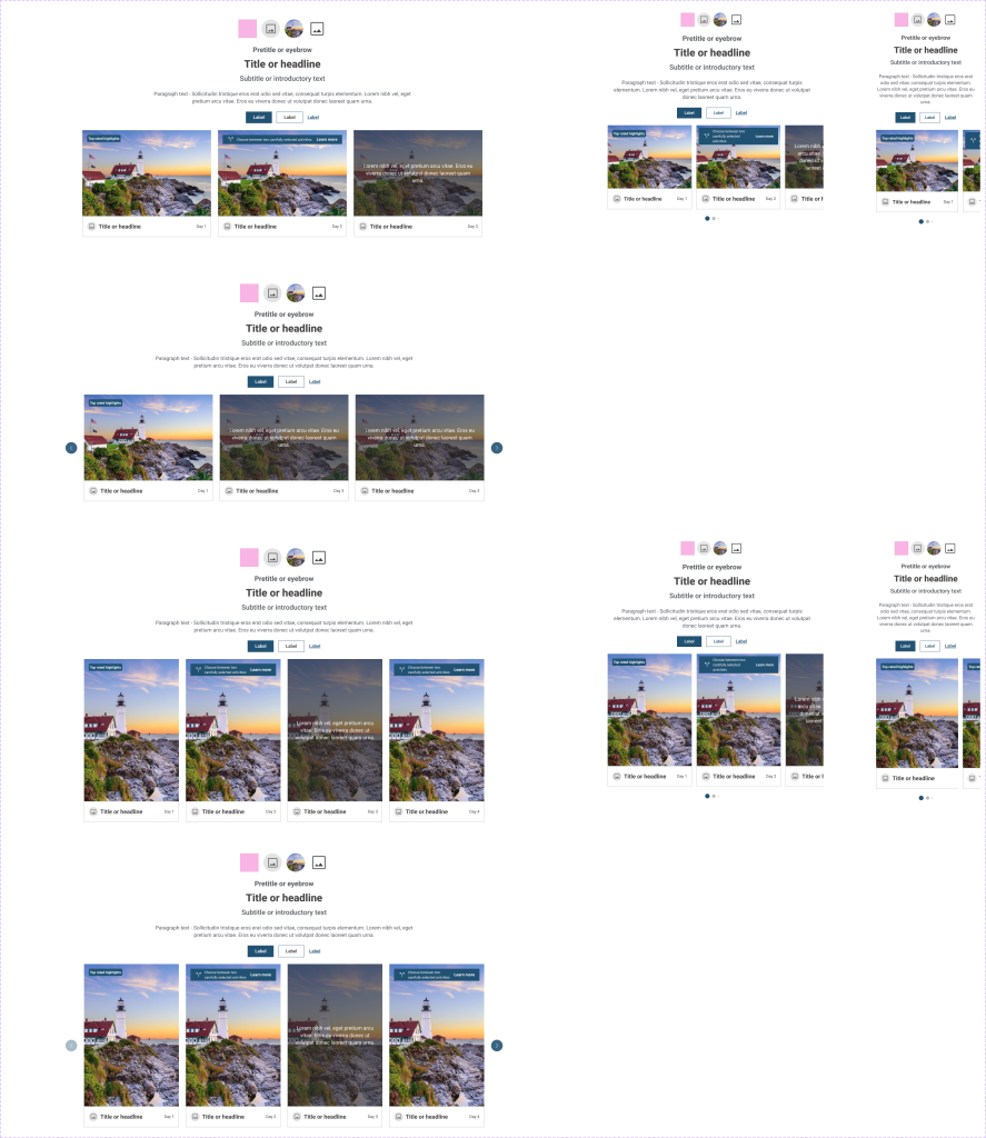
Organisms: Larger, self-contained components such as cards or content blocks that can stand on their own within layouts.
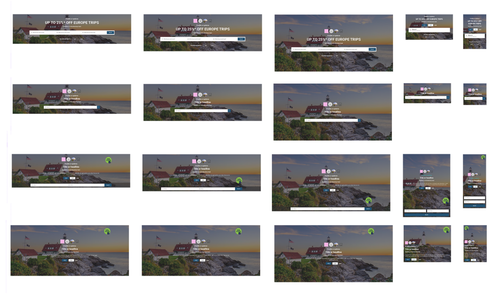
The final image shows the complete component, which includes variations to accommodate different brand styles and content types. This structured approach ensures consistency, scalability, and flexibility across all interfaces and design outputs.

Some components here
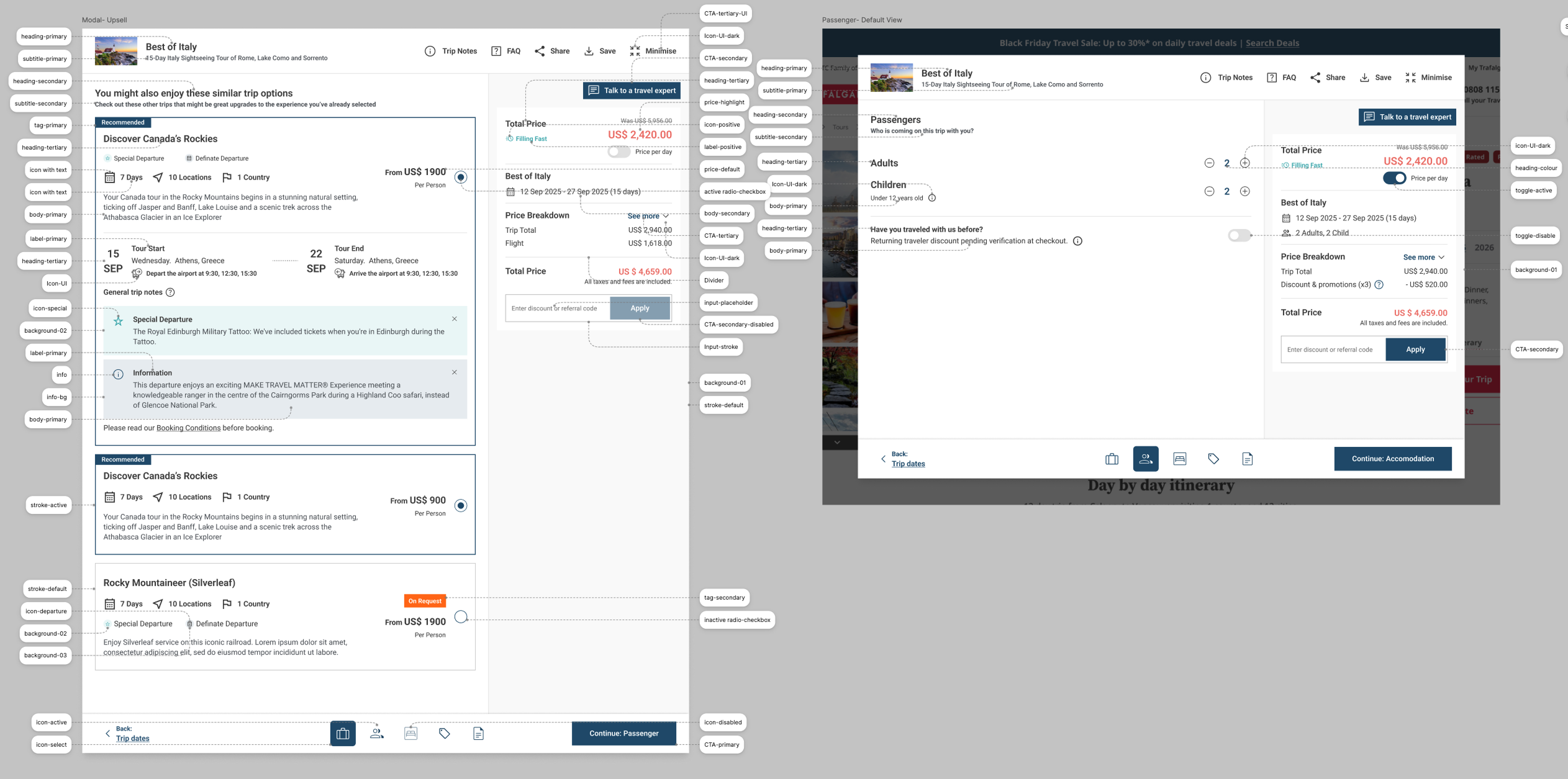
Token naming exercise for shopping cart process flow
Problem:
When switching between brand libraries, colour and typography styles didn’t translate correctly. Many colours weren’t accessible or visually consistent, leading to poor cross-brand cohesion and usability issues.
Challenge:
We needed a scalable, software-friendly solution that ensured design consistency and accessibility across multiple brands — and we had to deliver it under tight deadlines.
My Role & Solution:
I proposed creating a structured system of semantic design tokens that better aligned with software development practices rather than web-only conventions. For example, instead of using generic style names like “Primary-01” or “Paragraph-link,” I introduced functional names such as heading-primary, body-primary, icon-active, and icon-hover.
I collaborated with an external design agency to validate and extend this token system, ensuring that each brand’s colours could be mapped accurately. Once finalised, I integrated the new token structure into Figma as variables, allowing designers to easily swap brand themes while maintaining visual consistency and accessibility.
Outcome:
Despite time constraints and significant internal pressure, we successfully delivered the new token system on schedule. The development team was able to implement it seamlessly, enabling scalable, accessible, and easily maintainable multi-brand design handovers.
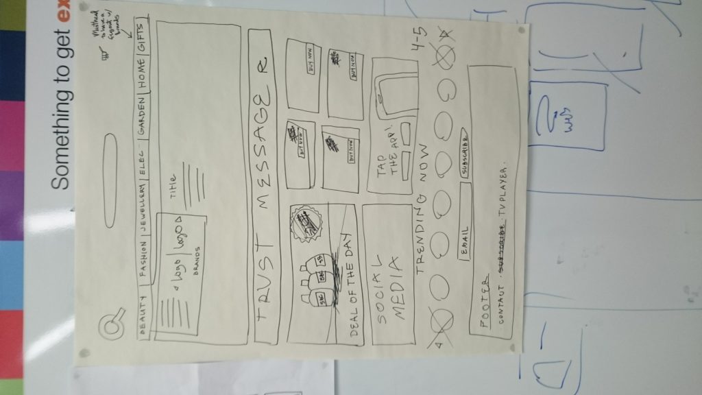
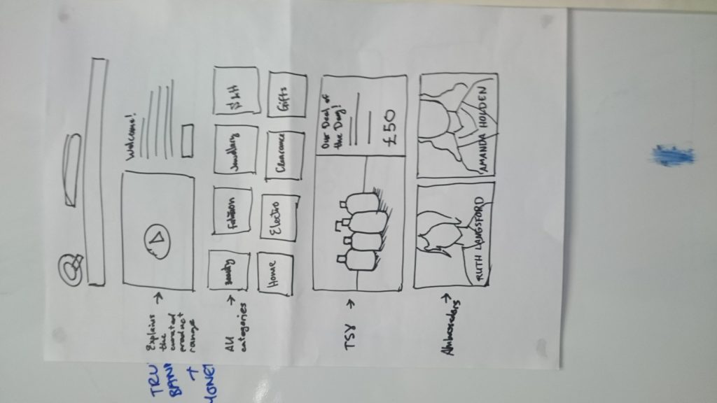
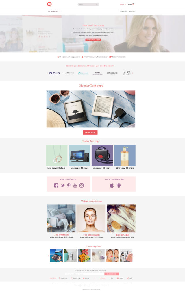
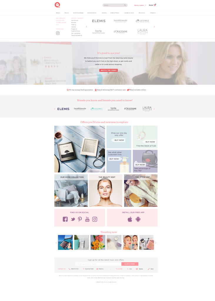
A/B testing homepage designs with drawing below
I have experience conducting A/B testing using tools like Optimizely, Hotjar, Monotate, Crazy Egg, and Google Optimize. In the project below, we specifically used Monotate to create live scenarios that optimised engagement. By tailoring content based on users’ purchase and search history, we were able to show logged-in customers personalised experiences, resulting in higher interaction and improved conversion metrics.
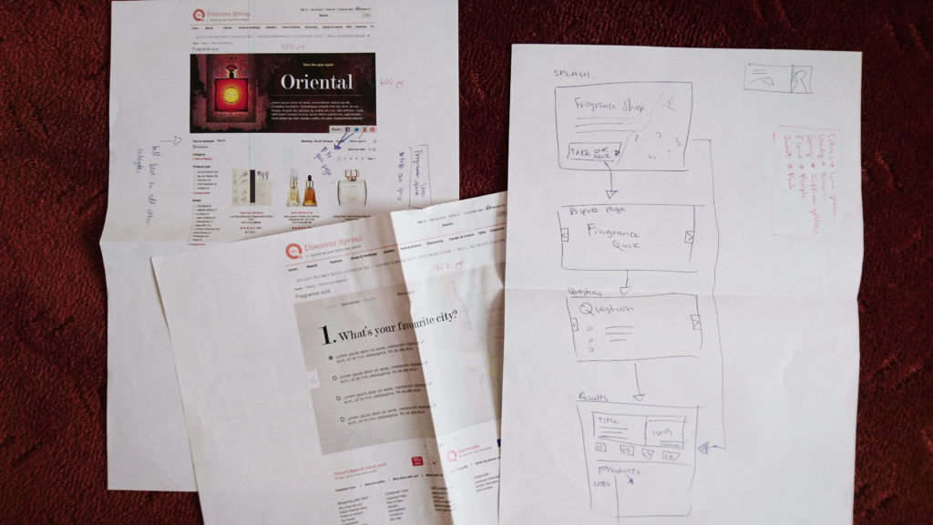
User Flows
I created detailed user flows in Figma to map how users navigate through the project. By visualising every possible path — from beginning to end — I identified friction points and streamlined the experience. This process reduced unnecessary steps, improved task completion rates, and provided a clear blueprint for both designers and developers. The refined flow ensured consistency across screens and contributed to a smoother, more intuitive user journey.
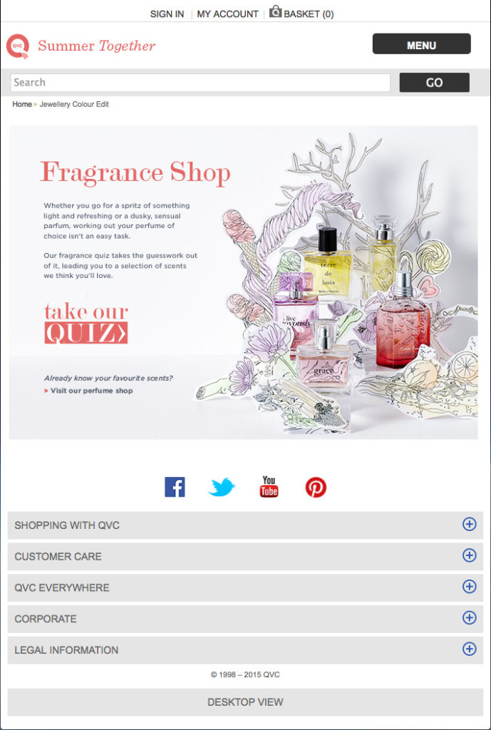
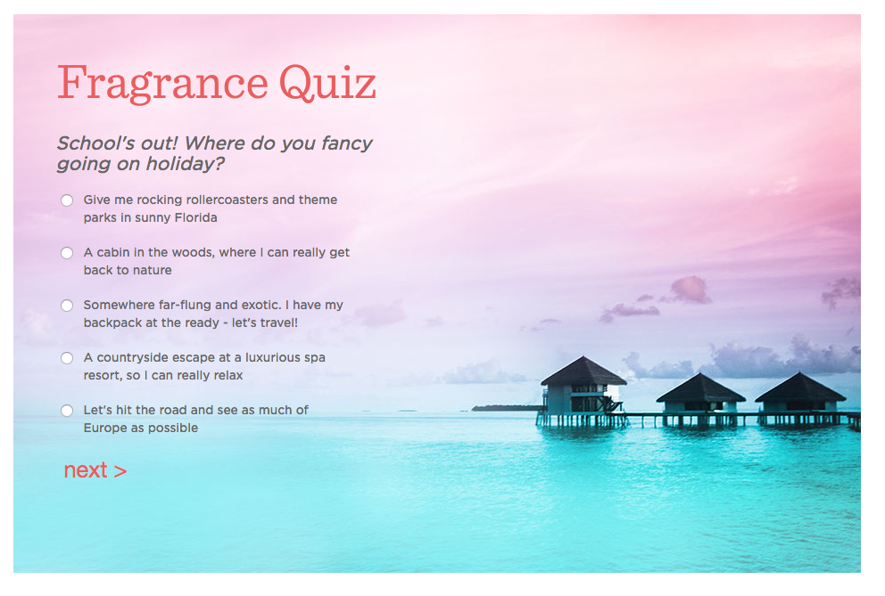
Fragrance Quiz
Customer Services Form User Flow
I mapped out this user flow with visually supported mockups, as Synega requested clear visual aids to represent the flow. The goal was to create a simple, intuitive process with as few clicks as possible—allowing users to complete the form quickly without uncertainty or boredom.
The main requirements from Synega were:
-
A clear and easy-to-understand flow
-
Minimal steps to completion
-
Visually guided forms that keep users engaged
These objectives were successfully achieved. Post-launch, the form saw high engagement, strong click-through rates, and excellent completion metrics, validating the effectiveness of the design.

Shopping Cart Basic User Flow
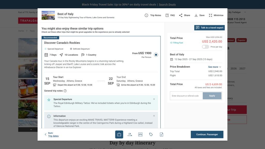
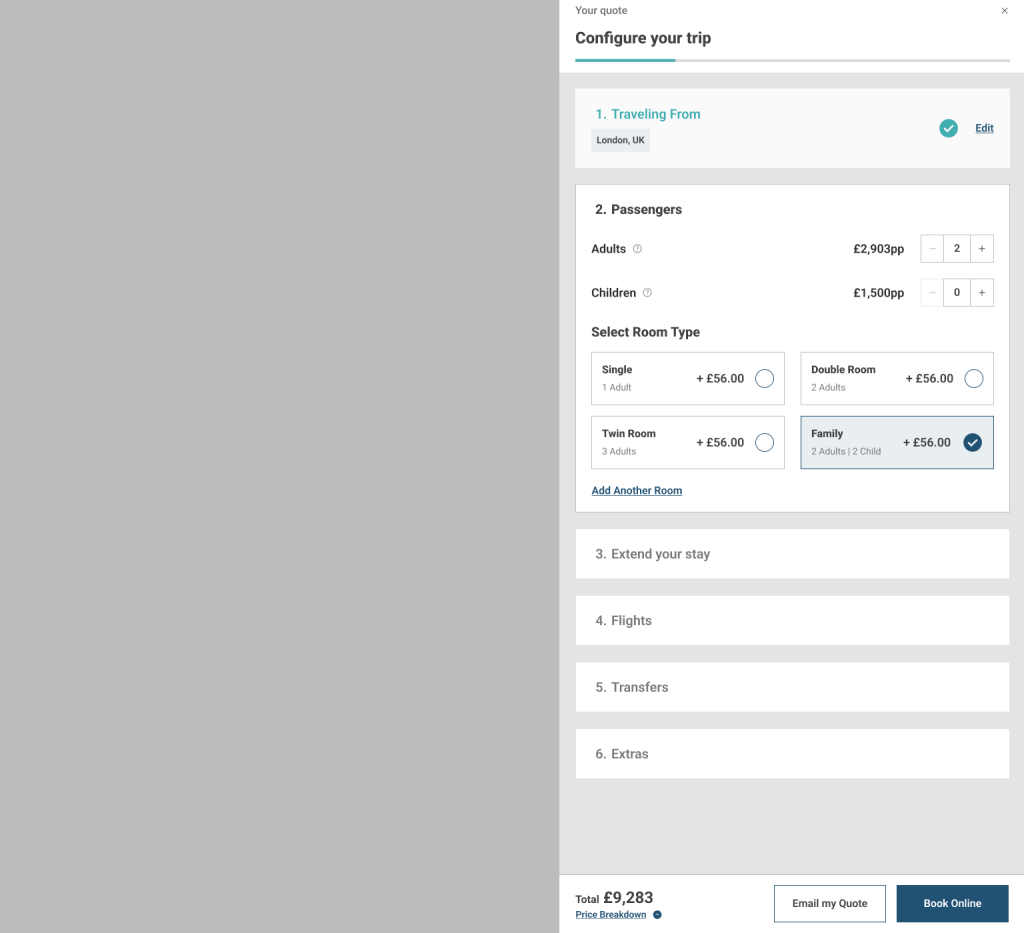
The shopping cart flow for TTC tour brands previously relied on multiple external and internal systems, which disrupted the user journey. The aim of this project was to create a seamless widget so that the shopping cart could function without opening a new URL or window, keeping customers on the site throughout the transaction.
While creating a widget might seem straightforward, the complexity arose from integrating multiple brands with different systems, each requiring different pieces of information to display correctly. Early iterations highlighted gaps in requirements, causing a temporary pause in the project to clarify and redefine specifications.
Once the requirements were finalised, we prototyped three different widget types to determine the most effective approach, conducted A/B testing using Optimizely to evaluate the look and feel of the widgets along with refinement of the journey. Based on user preference, we moved forward with a modal-based design.
During testing, we also evaluated various sections within the shopping cart flow. Insights from these tests informed the design of the most effective components, ensuring a smooth, intuitive, and engaging checkout experience for customers.
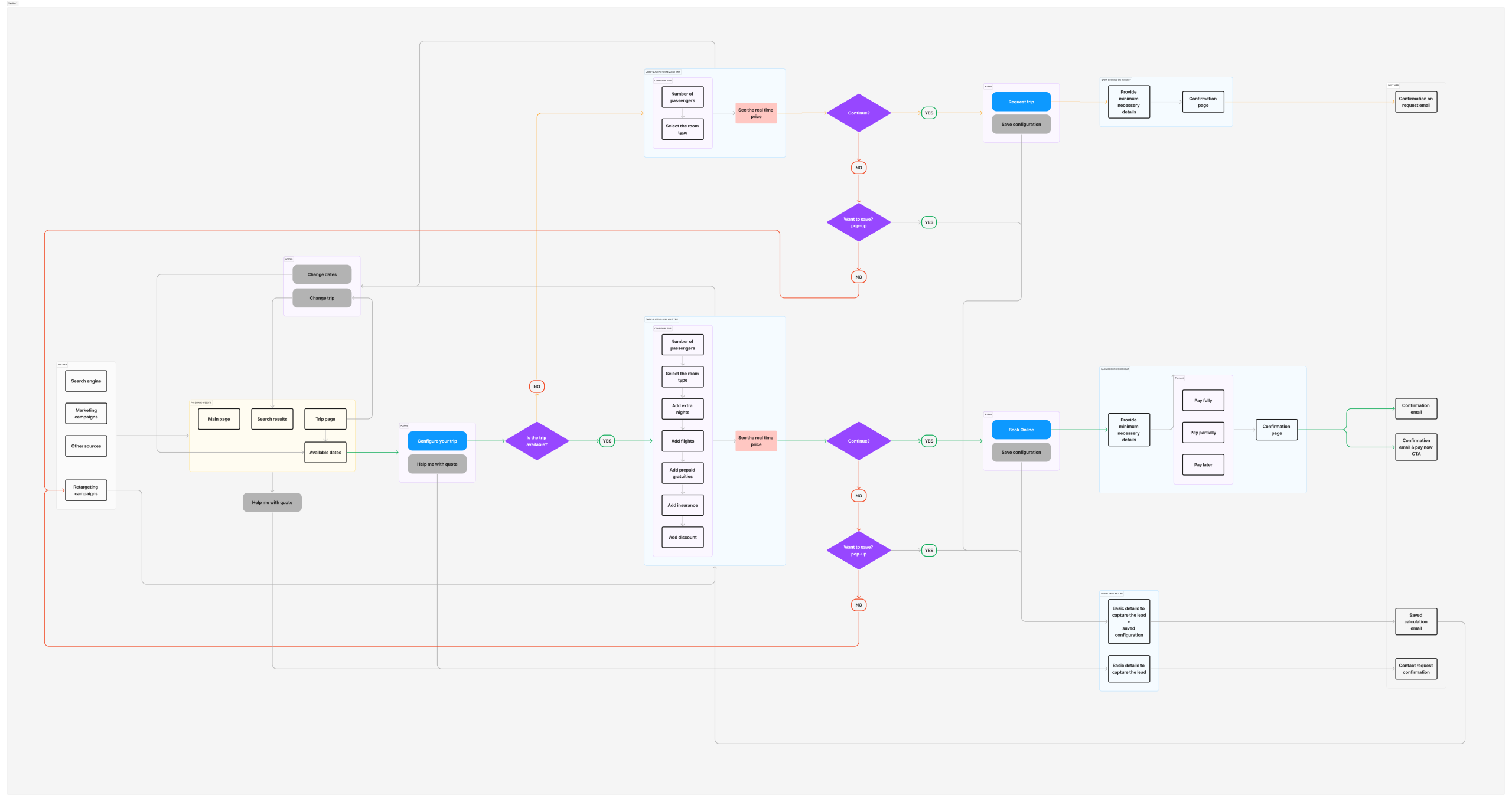
Shopping Cart design ideas for widget intergration
UX/UI Design for Salesforce
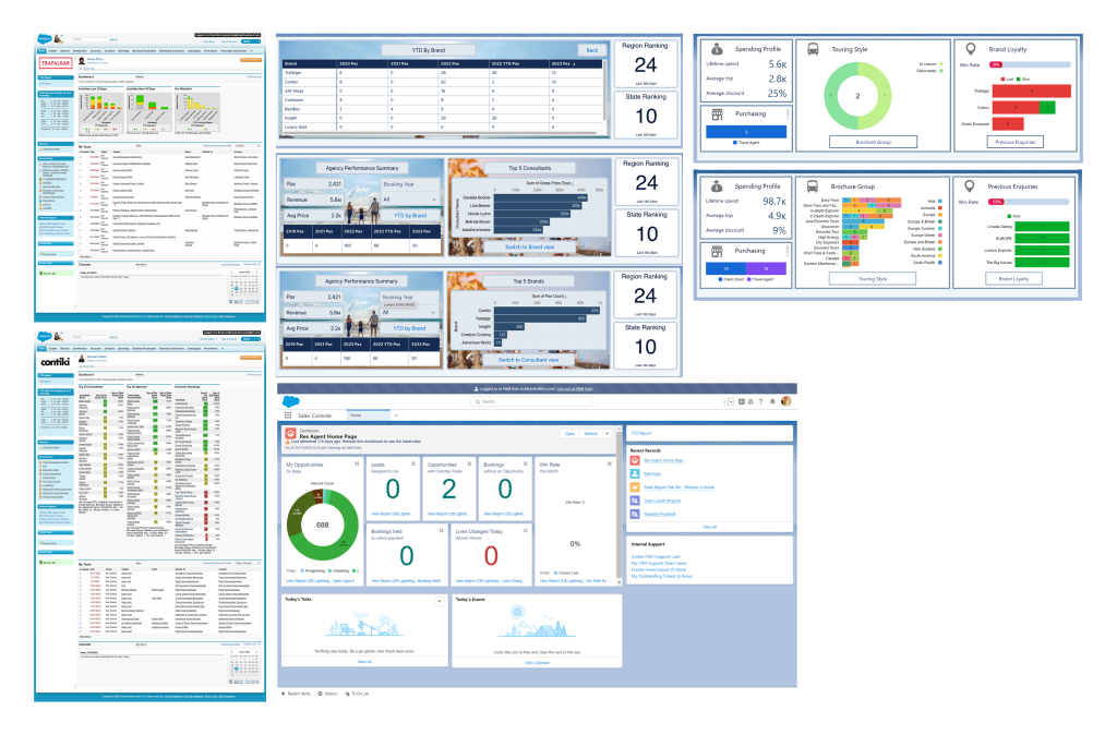
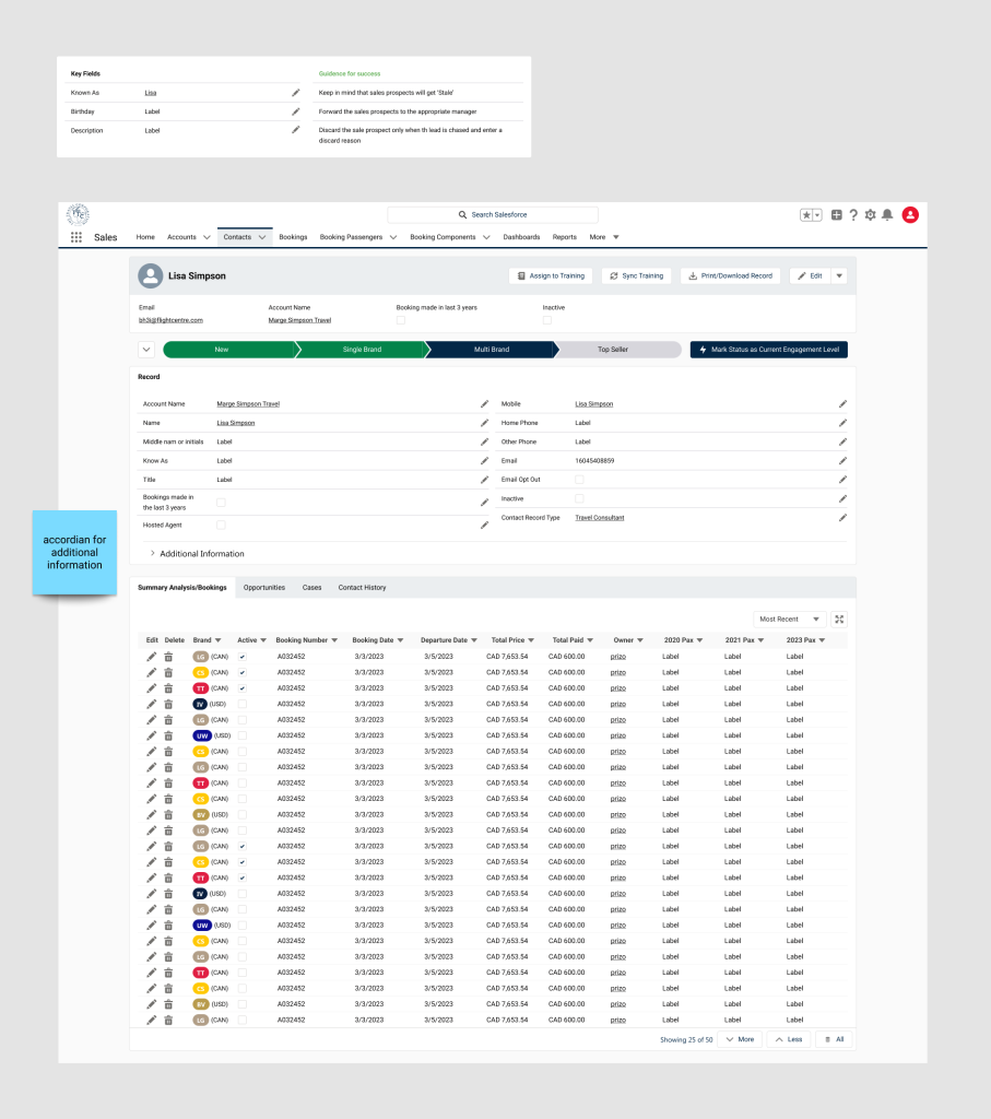
Salesforce is the core tool used by TTC’s sales teams worldwide for customer interactions. The existing system was built on the older Salesforce platform, and the tech team wanted to migrate to the new version while improving the UX/UI simultaneously.
The team approached me with detailed requirements and user research already completed, which provided a strong foundation. Although I had never used Salesforce before, I quickly familiarized myself with the platform and leveraged the Figma Salesforce Lightning Design System to efficiently create templates using pre-built components. This approach accelerated both my design process and the subsequent development of screens.
Regular meetings with the team helped clarify UI improvements, while ongoing reference to customer research ensured that the UX was continuously optimized.
The project spanned three months on the design side. Thanks to the pre-defined requirements and research, I was able to deliver all designs within nine weeks, helping the team stay on track for the full rollout six months later.
